Thursday 12 December 2013

Innocent Drinks// Presentation Boards for Thursday

 Over the summer holidays I wasn’t sure how to go about the briefs I wanted to create for third year. I was given advice from a friend to contact studios and see what they could offer. The one that got back to me was Innocent Drinks. Claire, the senior designer said I should have a go at designing a back of pack design.

The back of pack design can be random if you choose it to be, these examples to the right are that, but are still a fun and a humorous read. Claire said to do something about the company, stuff about the drink the person is drinking.
I decided to do 5 designs and apply them to the Innocent carton.  

Here is the template of the standard Innocent carton. This was sent with the email and meant I could actually apply my design to the carton. 

 My first design is an info graphics piece that shows the reader what vitamins are in the strawberry and banana smoothie and how these vitamins are good for you. Its ideas like this that I applied to the rest of my designs.The next design is simply educating the reader to the innocent drinks foundation. The Innocent Drinks foundation is made up of farms around that world that Innocent buys from and supports.

The Big Knit is a yearly event where the public can hand make a small hat for charity. The money goes towards the elderly to keep them warm in the winter months.

Strawberry and banana facts and figures I enjoyed making. Simply fun facts about the fruits that most people won’t know about. 

Lastly, I wanted the make a design that was full of colour. All I wanted to show in the design was the new smoothie that Innocent had thought up. The smoothie is full of tropical fruit so I went along the lines of making a tropical beach with palm trees. I then sent the designs to Claire from Innocent to get some feedback.

Once the designs had been applied to the cartoon, all I had to do was print them out and create the carton. This was a lot easier said than done. 

I first printed on matt. I bought one Innocent carton and deconstructed it to find out exactly how to do it.  The first and second attempt went very wrong. Eventually it worked and I felt comfortable enough to print on matt and laminate. Every time I folded the outcome seemed to go wrong. I must have been the thicker stock. After many attempts the cartons slowly started coming together. 

The caps of the cartons I took off real Innocent cartons. This was expensive but makes my mock ups look identical to the actual product. With help from double sided tape I could apply the caps without too much hassle. 

The photos will have to be re-done. Despite asking for help in the photography studio I still couldn’t get the photos I wanted. It was very hard to eliminate the shadows completely so next time I will ask a friend from photography to guide me.

Overall this brief has been very enjoyable. I can’t explain how difficult folding the cartons was and the time I spent doing it but at least its done. Many times I thought about giving up and handing in the designs on paper. 

This brief isn’t completed because I need to photograph the cartons again next term. Hopefully I will be able to get some photos that will give credit to the cartons and my designs. This was the first experience I have had where I could get feedback from someone out side college. Claire  was very helpful in seeing the designs made sense and were executed properly.

Monday 9 December 2013

Dr Me// Printed Flag


Here is the flag hanging up. We decided to clear a space in studio 3 and get some photos to put on our presentation boards for Thursday. 

We managed to get the edges hemmed by a friend from fashion and went about hanging the flag to photograph. It looks great when hung up so we are both very excited to see it in the exhibition on Friday. 

This brief has been short but very enjoyable. Emily and I have worked together in workshops before and seemed to work very well during this process. 

We could both be honest with each other but luckily most the time we agreed on the look in our design. This has been the first brief this year  I have done working with somebody else. I seem to work better in a group of two as ideas come up twice as quick and I tend to work harder as to not disappoint! I look forward to working in a pair again soon.

We were emailed by Dr.Me saying that someone wanted to buy our flag which was great news. However after emailing back consistantly every week we didn’t here anything back from Dr.Me.

...........................................................................................................................................................

This brief has been short but very enjoyable. Emily and I have worked together in workshops before in the past and seemed to work very well during this process. We could both be honest with each other but luckily most the time we agreed on the look in our design. 

This was the first brief I did of the year in a collaboration and afterwards I had much confidence to be in a collaboration again. It was great to see our design in the Dr. Me exhibition and it was even better when somebody wanted to by the flag. Unfortunately that didn’t go through with and we don’t really know where our
flag is. 

This has been the first time I have produced work for an exhibition. To me the feeling of a brief changes when you have to produce something that will be presented in front of many people. This sort of emotion when it comes to design relates to my feelings of producing work for the end of year show. All in all this brief has been a short and very enjoyable experience that I will remember for a long time. Exhibiting your work is something I want to return to in the near future. 


The Outsiders// Ebook// Ipad


The second example is a little blurry but this is what the cover would look like if it was on a ebook, in this case on an ipad. ebooks are becoming increasingly popular so it made sense to mock it up.

The Outsiders// Bookmarks


The bookmarks are simple and their use is obvious. Therefore I simply took visuals from the book cover and put them over a simple book mark template I created. The first 10 examples are over this template however I had the idea to have just the knife on its own as a bookmark. I would print it on a thick stock so it doesn't bend easily and the end of the knife might easily be bent. Then again I must think about how thick this knife would be and if it is a hazard. Therefore, I took the design again I rounded the end so to make it safer. If you got it in the eye it could be quite dangerous! 


By doing this I have made the bookmark less dangerous....I'm beginning to question whether this is a good idea at all. Maybe having the bookmark like the first examples would be more suitable. Some feedback is what I need but I can already sense what people would say about the knife bookmark idea!
...................................................................................................................................................................


I've decided to go with these examples, they are simple but work well in being a bookmark! The edges have been rounded quite a lot on these. More on the second example than the first. These will eventually be printed on a thick stock to avoid breakage. A flexible font could work well on the other hand.

The Outsiders// Promotional Poster and In Context


I thought I would mock up my poster in places you would most likely see promotional posters for books. My first thought was the London Underground so went about playing around with the poster and spaces in the Underground.

Saturday 7 December 2013

Dr Me// Printing the Flag


The print in total cost £14.00 which was great considering Emily and I where both paying. There was only on hiccup with the flag which is my fault really and thats there is something wrong in the design. It's very minor but on the massive flag it is a bit obvious. Any how the flag does look great and both Emily and I are very happy with it. All there is to do now is cut the corners and send it to Manchester for the exhibition next week!

Thursday 5 December 2013

Elmwood// New buisness card, leaflets, posters// TRIPLEXING

Triplexing


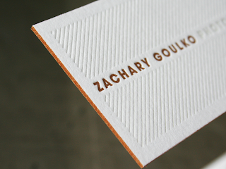
To make my business card thicker I am going to use a process called triplexing. This is when you stick three different peices of stock together. Creating a sandwich of card. This will ultimately make my business cards more interesting and visually pleasing!
...................................................................................................................................................................


So I went ahead and changed the background colour to a blue as that is what people suggested in the crit. Personally I think it looks better now so that a relief. I also changed the slogan to 'Your Pane Is Our Pleasure'.

When it comes to printing the process will be very straight forward. I will print these on a matt, which is relatively flexible but more to the point cheap to print on yet it has a good finish. I will then find a harder and thicker stock. This stock will be placed between the font and back of the business card. At the moment I am just going to use a white, but a blue could prove to be much more effective. 

SPELLING MISTAKE! ORGANISATION IS SPELT WRONG. 
...................................................................................................................................................................

Leaflets 


My idea for this also involves Triplexing. However the centre stock will be made out of assatate so that you can see through the leaflet. This will give the idea of a window being cleaned. This idea is so simple but will be very effective. The leaflet will simply have information about the company and how to contact.  


Here is another example I put together. It is looking a bit crowded though thats the only problem I have with it at the moment! 

Billboard


This defiantly doesn't work! But there is something there that I can work on. Maybe make it a little more simple and get rid of all those lines.

CRITS// The Outsiders, Innocent & Elmwood


We had our crits in a group of ten or so. I decided to bring in 3 of my briefs that were near completion.
...................................................................................................................................................................

Elmwood


Make other products.
  • Bucket.
  • Invoice. 
  • Web.
  • Absence Card.
  • Leaflet.
Colours? Make them more blue. 

Innocent Drinks


  • Maybe consider making promotional material?
  • Photograph final photographs and upload to blog. 
  • Make presentation Boards 
The Outsiders


  • Is the cover appropriate for a children and adult audience- Considering the book isn't actually that suitable for children, we think so!
  • Change background colour, make it more light possibly?
  • Other Products- Bookmarks, Posters, DVD Case, Ebook. 
  • Make type smaller on back.

The Outsiders// Construction of Cover, Front, back & spine

Due to time I am not going to be screen printing for the hand in. I feel it will be better to get the breif done rather than spending heaps of time screen printing. This will be something I hope to do next year some time.


The last example is how far I have got before crits today, Once I have got my feedback I will apply what needs changing. The bar code is something I am really trying tyo work out, there is a way of applying the magic wand tool but on illustrator. Hopefully someone in my group will know how to do this! I want to apply the same colours as the cover. Not just a simple white and black. 

Tuesday 3 December 2013

Elmwood// Possible New Concept


I think this would really make the card stand out even more, the idea is to have the squegee at the top of the business card and then you can pull it out of another sleeve. Just like the example I have underneath my design. This will defiantly make the the company more outstanding. Having this playful idea also makes the tone of voice more fun and friendly. 

Or maybe the leaflet could be this? I think that would probably be more appropriate. The buiness card can be part of the leaflet. Almost like a mail shot. 

Elmwood// Window Cleaner// Presentation Boards for first crit


...................................................................................................................................................................
Feedback