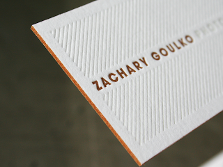
Triplexing
To make my business card thicker I am going to use a process called triplexing. This is when you stick three different peices of stock together. Creating a sandwich of card. This will ultimately make my business cards more interesting and visually pleasing!
...................................................................................................................................................................
So I went ahead and changed the background colour to a blue as that is what people suggested in the crit. Personally I think it looks better now so that a relief. I also changed the slogan to 'Your Pane Is Our Pleasure'.
When it comes to printing the process will be very straight forward. I will print these on a matt, which is relatively flexible but more to the point cheap to print on yet it has a good finish. I will then find a harder and thicker stock. This stock will be placed between the font and back of the business card. At the moment I am just going to use a white, but a blue could prove to be much more effective.
SPELLING MISTAKE! ORGANISATION IS SPELT WRONG.
...................................................................................................................................................................
Leaflets
My idea for this also involves Triplexing. However the centre stock will be made out of assatate so that you can see through the leaflet. This will give the idea of a window being cleaned. This idea is so simple but will be very effective. The leaflet will simply have information about the company and how to contact.
Here is another example I put together. It is looking a bit crowded though thats the only problem I have with it at the moment!
Billboard
This defiantly doesn't work! But there is something there that I can work on. Maybe make it a little more simple and get rid of all those lines.


No comments:
Post a Comment