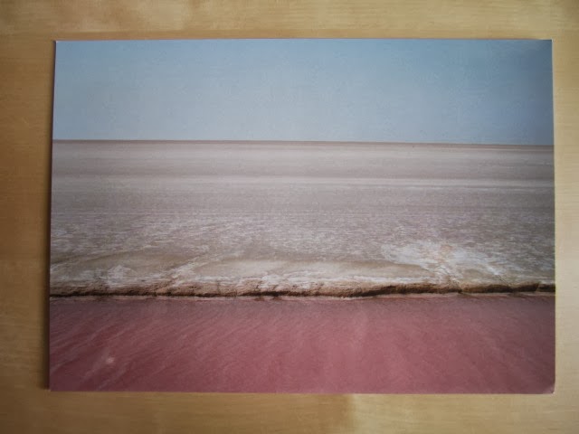
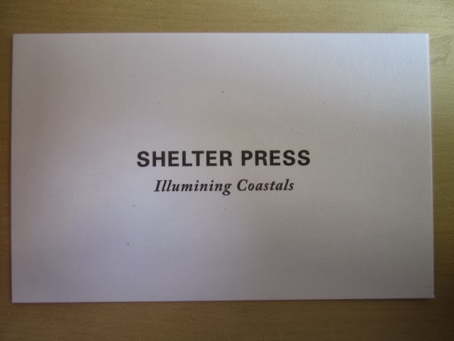
During November last year George went to Paris and during an exhibition at Paris Photo picked up a few free promotion items for popular photographers. Below are photos of the promotional material from Paris Photo. I talked with george about what he liked but until we talk again about what we both want to achieve I will analyse these and see what I like and see what could work.
Gost
This has to be my favriote example from the pack of branding George handed over to me. It has been triplexed which is very much something I want to do in the future for my self branding. The font is perfect and so is the simplicity of the branding in general. This is a great example of a clean and professional finish that is eye catching and attractive.
This example is ok, I think that the finish could have been made better be printing on a different stock, maybe one with a nicer texture. I also think the front should have been a bit more simple. If they just has Colour & Books and nothing else this would have made for a more poweful look.


No comments:
Post a Comment