Ed & Deanna Templeton
A new zine by Ed & Deanna Templeton featuring two subjects they are quite familiar with, girls and skateboards. Published by the Deadbeat Club, Niñas Patineta is a 60 page “celebration of females on skateboards.” Firstly I notice the simlicity of the publication and realise it is all about keeping the colours and layout simple so the photos are given the opportunity to speak for themselves.
The Independent Photo Book
A paper is potential a route I could go down. This is a cheap and good way of promoting you photography but it does have some down sides. The first being its large and difficult to handle. Most newspapers are an a3 size so they are floppy. The other problem is you can get the best print on newspaper stock. It looks desaturated and doesn't give the photo its full benefit.
Utahether
A lot of my photography is portrait and I was worried that using a portrait booklet with landscape photos would make the photos to small. This example above however has changed my mind on this and has showed me that it still works wonders. Again we have a zine here that is very plain with simple text. This is most defiantly the road I want to go down.
Year One
I decided to blog this as when all my books are printed there will be a total of 6 maybe more. The example above shows the same zine printed many times and got me thinking about whether or not my books should have packaging? I do like the idea of them being separate to each other though so I guess this will be something I come back to later down the line.
Guide To Emerging Art Photography
This got me thinking about vinyl. I love the idea of the front cover being plain with simply my name and the event within...for example:
Simon Isles
--------------------
Barcelona 2013
This is all that is need. The texture and overall look of vinyl is eye catching and could attract the person to look through the zine. I'm consideing to make one large print that is framed for every zine. This means the photo will sell the zine. Imagine at an exhibtion for example. Each zine will have a large framed photograph
Kiss It Goodbye (Packaging)
Again we look at packaging. This is really similar the a half case. I don't know what this is called. A quarter case? Anyway this could work nicely on my publications. I don't on the other hand want to over complicate things. I could have an image underneath and on the half case have my name and the publication name.
Portsmouth Culture
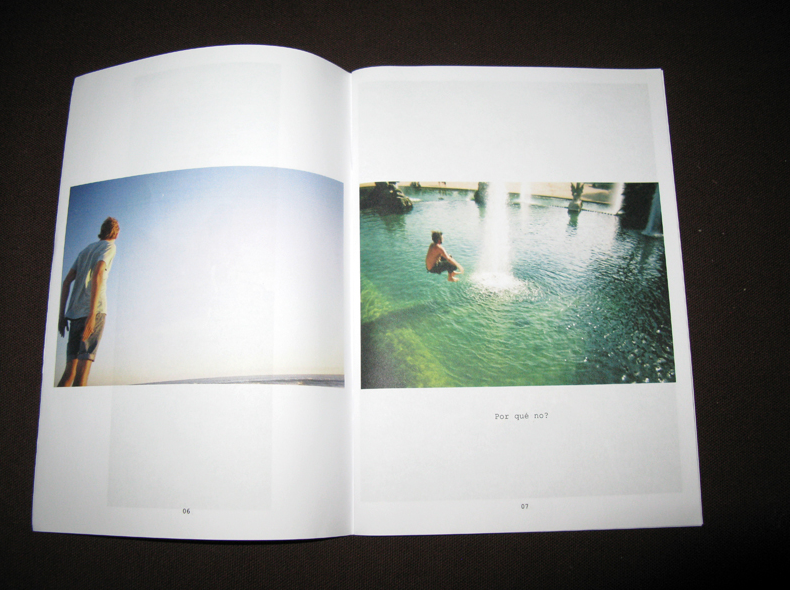
Double plage spreads. This is the best way of presenting landscape photography is a zine. Personally I wouldn't do this on every page, like this zine I would just use a large landscape photo in the centre. This also means that if the person now owning the zine wants, they can rip it out and put it on thier wall.
Make Great Pets
Another example of simplicity within zine design. This is defiantly what I want to go with now. All I want it to have simple text giving the smallest bit of information about the photo. As in just a couple of words. This will allow the person reading to learn that tiny bit more about the photograph and help create their story of what the photograph is trying to say.
We Want To Believe
Earlier I talked about half cases and here is another example of that technique being use. This is however a bit to destructive towards the photo underneath. The text is taking over the image which isn't what you want when making a zine about photography. I do want a cover with only text but I think thats different.
The photo when being used should be the centre of attention. No text should be used with the image or on the image unless the text is already in the photograph. My zine with have very simple text and an easily legible font.
These zines above have been good research but I think I need to go out and find my own zines. Ones I can touch and really look at properly. This will enhance my thought process and give me a much better idea of what is possible and maybe what is not possible.


