Saturday, 30 November 2013

Dr Me// Development


Emily and I took this shape and decided to play around with it and this is what we have come up with so far. We want to get a zebra in there somehow because this design reminds us of a zebra basically! We have decided to go away with the design and do some of our own examples and meet after the weekend to see what we both have. 
...................................................................................................................................................................


The head is simply one I found on google images that has been live traced. 


Heres our final outcome and if I'm honest I'm very happy with it. Visually theres a lot going on but it doesn't hurt your eyes! Emily and I have booked to print this in Print and Textiles on Friday at 1pm. This will be a first for me but I think Emily has had some experience with printing on to fabric. This will, once printed be a big piece of work. Off the top of my head I can't remember the exact size, this means we can't afford any mistakes when it comes to printing! Overall though this process of development with Emily has gone smoothly. It's nice to come away from the experience with a design we both like.

Monday, 25 November 2013

Innocent Drinks// Packaging Revisit

New Nets Printed.


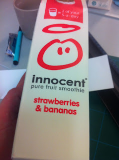
Now that I have successfully folded the innocent carton I have decided to take away the pink lines to make my packaging more similar to the original packaging. I have also decided that I will laminate my packaging. The actual innocent packaging has a very laminated look and finish. This might make my packaging harder to fold but the end result will look a lot better. I need to find out where I can find very cheap juice so I can steal the lid. I must involve the lid to give my innocent packaging a very similar finish to the original packaging. Below is my progress through my mock up example:
...............................................................................................................................................
Innocent drink cartons and my own Innocent drink Mock up.


After buying the innocent cartons I got a much better idea of how to construct my carton. So once I had finally made the mock up carton I had the confidence to spend the money on the more expensive packaging. 
...............................................................................................................................................
First carton construction different print process. 


Although the photos make is out to look like everything is going well, everything isn't going well at all really. I decided, like my Dead Stray brief, to print matt and then laminate. Folding laminated matt paper is quite easy but because the carton has to be folded quite a lot the laminate paper is very tricky to deal with. Also, I took away most of the pink lines which caused finding key folding places that little bit harder.This example above I will have to bin,  but I have the other 4 to play with and make perfect. I want to get this brief wrapped up for Friday, including getting to the photography department. There are other briefs I must attend to and considering my dissertation need doing there is also that to think about too. 

Wednesday, 20 November 2013

The Outsiders// Screens for tomorrow and predicted Final Outcome


Screen One


Screen Two

Screen Three

It took a while but everything on my design is perfectly aligned and I know for a fact the spelling is all correct. As you can see I will have a total of 3 screens so 3 different colours. Mt first job is to go to the print rooms and print on to a speical paper before going down the road.


The Outsiders// Chosen Few Cover Designs// Experimentation and Final Cover


..................................................................................................................................................


Above is what I hope to be the front cover. Initially I only wanted two colours so two screens but I have decided it would really do it wonders making three screens. Tonight I will get them ready for screen printing tomorrow. Hopefully everything will go smoothly, I have been lead to believe that I will get lots of help at Vernon Street so thats great news!

Prints for exposure


Tuesday, 19 November 2013

The Outsiders// First Designs


So I have gone with the flip knife as the illustration as that is something that comes up a lot in the story and is something that really changes the story after the stabbing at the fountain. The red I like but it gives the cover a horror genre look. I am very happy with the font though I think it fits the book perfectly. 


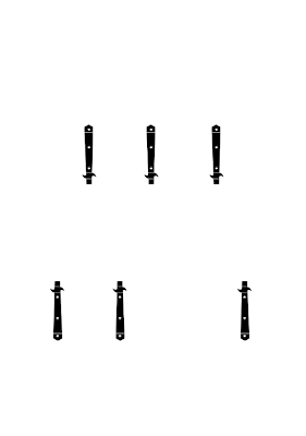
The gold dagger stand for the quote in the movie 'stay gold pony boy, stay gold. The seven daggers represents the seven members of the greasers gang. The poster is still missing something though. I know for a fact that the red is a colour too bloody and horror like. This book is aimed at children so I think its time to think about the design in terms of my audience! I think a blue would look nice as that would represent the water fountain which is a major part of the book .


I like this example above, this flip knives have been pushed closer together and the colour I feel it more interesting.


I like this one above, But I'm worried about the cover not being suitable for children? Personally I feel the cover reflects the book quite well! 

Still can't decided on a design. I am going to take two of these forward and work into them. I keep on liking these covers and then hating them again. I'm starting to feel like going back to previous designs but I'm not sure! Tomorrow I will be screenprinting so I think it is important I get this design wrapped up today.