Tuesday, 3 December 2013

Elmwood// Possible New Concept


I think this would really make the card stand out even more, the idea is to have the squegee at the top of the business card and then you can pull it out of another sleeve. Just like the example I have underneath my design. This will defiantly make the the company more outstanding. Having this playful idea also makes the tone of voice more fun and friendly. 

Or maybe the leaflet could be this? I think that would probably be more appropriate. The buiness card can be part of the leaflet. Almost like a mail shot. 

Elmwood// Window Cleaner// Presentation Boards for first crit


...................................................................................................................................................................
Feedback

Monday, 2 December 2013

Elmwood Window Cleaner// Development


First screenshot, I like the illustration because its easy to understand. Maybe I can make CV out of these lines, then again CV isn't right, I might change the name so that it isn't CV. 
  • Clearer Vision
  • Clean Windows
  • Pane Free 
  • Paneless 
  • Squeaky Clean
  • Window Wish
  • Window Wipers
  • Window Wonders 
  • Stay Clear

...................................................................................................................................................................


I very much Like this idea, the idea of the wiper they use going in this formation down a window. The only problem with this is it looks a bit too much like a pipe? Could end up looking like its for a plumber maybe? I will experiment a little more to see if I can make it look anyless like its for a plumber.


The example above I have just constructed works much better I feel. You now get the idea of movement with the brush. I think it would be a good idea to make the type for this similar to my illustration? 


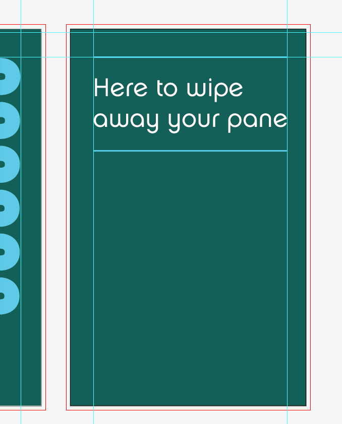
Now I've decided to think about the back. I want the font to be classy and at the same time friendly, I don't want to use a bold font that is to formal and serious.


I've deicded to go with 'PANE FREE'. Its catchy and is humorous at the same time. 

I very much like the outcome of these business cards and they are a good starting point to making other things like a mock up of the van and works mans t-shirts. For the crit tomorrow I plan to put together a few boards explaining what it is I have done and what I want to do. I look forward to receiving feedback to my work as this will make my final outcome even stronger.
...................................................................................................................................................................
Mock up of Van


A really quick mock up just to see what the logo would look like on the side of the van. I hope I'm the only one that kind of thinks this is a free window cleaning service because that wouldn't be a good thought.
...................................................................................................................................................................
T-Shirt

Again, I quick and simple mock up just to give an idea to what the works man shirt would look like. 

Elmwood Window Cleaner// Secondary Business Card Research

The Johnsons Cleaners


In terms of making something out if the ordinary this most defitnaly ticks all the boxes. When someone wants to find something that stands out and is different this would do the trick. This is for laundrette, so already this is the sort of company thats relates to the one I need to brand. There are no picture of the business cards interior which is a shame. 


Elmwood Window Cleaner// Brief and Design Sheets.

Brief

Elmwood came in and presented a rebranding that they had recently done. We were then asked to walk to the front and put our hand into a bag and pick one piece of paper. On this paper would be a job of some kind, ranging from plumber to picture framer.

I got window cleaner.

...................................................................................................................................................................

Innocent Drinks// Packaging Finished!


Firstly heres a little look into how I did the screw caps. I simply took them from existing innocent cartons which was a very expensive investment but I wanted my cartons to be identical to the actual thing.  


This process has been a very difficult journey and my mock up that was printed just on matt (which was a cheaper print process) folded much differently to the matt laminated stock. This lead to me spending a lot of money on reprinting some of these cartons. However I didn't give up and I now have 5 finished cartons which just need to be photographed in the photography department now. 


Saturday, 30 November 2013

Dr Me// Development


Emily and I took this shape and decided to play around with it and this is what we have come up with so far. We want to get a zebra in there somehow because this design reminds us of a zebra basically! We have decided to go away with the design and do some of our own examples and meet after the weekend to see what we both have. 
...................................................................................................................................................................


The head is simply one I found on google images that has been live traced. 


Heres our final outcome and if I'm honest I'm very happy with it. Visually theres a lot going on but it doesn't hurt your eyes! Emily and I have booked to print this in Print and Textiles on Friday at 1pm. This will be a first for me but I think Emily has had some experience with printing on to fabric. This will, once printed be a big piece of work. Off the top of my head I can't remember the exact size, this means we can't afford any mistakes when it comes to printing! Overall though this process of development with Emily has gone smoothly. It's nice to come away from the experience with a design we both like.